Understand The Data
You may also find user manual, guidance on applying the Connectivity Tool or interpreting connectivity scores useful.
Main points
- The Connectivity Tool is based on the connectivity metric, which measures an individual's ability to reach employment, services, and social engagements.
- The metric evaluates the value of destinations and the opportunity to reach them using various modes of transport, including walking, cycling, driving, and public transport.
- Using this new method, we find that 1-hour connectivity metrics provide a good visual and numeric summary of the total value one can reach.
- Furthermore, the method captures that most value is located near urban centres, with origin points able to reach these centres benefiting from higher connectivity.
- The model shows that while active travel and public transport connectivity have clear "hot spots" located near the centres, travel using private vehicles can be seen as the "equaliser", bringing connectivity to rural areas.
- These are our first estimates of connectivity, and we welcome feedback to inform our future developments and refinements.
Introduction
The Connectivity metric measures someone’s ability to get where they want to go. It measures opportunity to travel to employment, services and for social reasons, weighted by people's overall proclivity to take those options. It aims to capture as the most common modes of travel and destination types, the time required to reach these destinations, the value presented by the destinations, and people's travel preferences.
It doesn’t show how many people take different routes: purely their opportunity to do so. Nor is it a transport model: there is no trip assignment or convergence processes.
Definitions and clarifications
In this guidance, “score” is used as shorthand for Connectivity score, or the Connectivity for one or more modes. “Starting location” refers to a selected grid square.
The metric is calculated only for starting locations in England and Wales. Trips that start in England and Wales and end in Scotland are included.
The default Connectivity metric (the ‘overall’ score in the Connectivity Tool) measures Connectivity by walking, cycling and public transport. Modes can also be considered on their own; the modes included in the Connectivity metric are:
- walking,
- cycling,
- public transport, including walking to and from public transport stops
- driving
- overall - which excludes driving, to represent sustainable modes of transportation. It is a weighted average, with weights determined by number of trips as reported in the National Travel Survey (NTS), and which are approximately 52%/40%/8% public transport, walking, and cycling, respectively.
The purposes of travel considered are:
- employment,
- visiting friends in their homes (residential),
- education,
- shopping,
- leisure and community,
- healthcare.
Data sources
We combine data for destinations (data on shops, services, places of leisure, employment, student numbers, and population), network infrastructure between these locations (for driving, public transport, and active travel), and willingness to travel (travel behaviour). We also use data obtained from user research sessions to inform the value of destinations and the diminishing returns of being able to access more of the same type.
Destinations
Data for all destination categories uses the best source of data based on quality assurance and exploratory analysis. The data has been procured at the address level, , with the exception of data on workplaces, which is available at the postcode level. The following sources were used for each destination category:
- Education: Department for Education official records
- Leisure & Community: Ordnance Survey AddressBase, Ordnance Survey Greenspaces, and OpenStreetMap data repositories
- Healthcare: NHS England
- Shopping: Ordnance Survey AddressBase supplemented by OpenStreetMap data
- Residential Properties: Ordnance Survey AddressBase
- Workplaces: Business Register and Employment Survey (BRES) dataset provided by the Office for National Statistics
All referenced datasets represent the most current available information (as a mix of Q4 2024 or Q1 2025 data), with the exception of the BRES dataset, which utilises 2023 provisional figures. This is due to the BRES dataset being released periodically, and the 2024 data not yet being available at the time of development, though this will be included in the next update.
Transport Networks
To determine which destinations are within reach of each origin, we need a graphical representation of the travel infrastructure, which represent the transport networks around Great Britain as millions of nodes and links (small sections of roads or pathways). Again, data sources were selected based on their quality and ease of use within the data pipeline. We use Ordnance Survey (OS) MasterMap network data for driving, OpenStreetMap for walking and cycling, and BaseMap for public transport.
Willingness to Travel
To determine willingness to travel, we use data from the National Travel Survey (NTS), years 2011-2020. This results in approximately 2.5 million unique trips. Data from all years are aggregated to obtain the total number of trips across all years for each combination of mode, purpose, and hour of the day, and length in minutes. It is worth noting that because data up to 2020 is used, the data that feeds into the Connectivity model doesn't capture post-Covid changes in travel patterns.
The data sources are summarised in the table below.
| High-level concept | Lower-level concept | Data provided | Data Source |
|---|---|---|---|
| Where do people want to go? | How, where, and when people travel | Self-reported number of trips by mode and purpose at different times of the day | DfT (National Travel Survey years 2011 – 2020) |
| Destinations that people may want to travel to | Locations and types of buildings | Ordnance Survey, DfE, NHS, OpenStreetMap | |
| Where can people go? | Value of reaching destinations | Input on diminishing returns parameters, relative importance of types, etc | Stakeholder engagement sessions |
| Employment opportunities | Number of jobs in each postcode for all sectors | Office for National Statistics | |
| People living within the area for social visits | Population estimates at the Output Area level (England & Wales) and Small Area Data Zones (Scotland) | Office for National Statistics, National Records of Scotland | |
| How can people get there? | Travel infrastructure: public transport | Public transport locations and travel timetables | BaseMap |
| Travel infrastructure: active travel & driving | Road and walking networks, including restricted access to certain paths | Ordnance Survey, OpenStreetMap | |
| Efficiency of travel by road for private drivers | Congestion data for road links in England, Scotland and Wales | DfT (Congestion Statistics) |
Methodology
The metric is calculated for each of approximately 15 million 100-metre square areas in England and Wales. Trips that start in England and Wales and end in Scotland are included, meaning that destinations in Scotland can contribute to Connectivity in locations outside of Scotland. The model calculates a connectivity score for each combination of purpose of travel, mode of travel, and time of day. The modes considered are walking, cycling, and driving. In addition, the public transport mode includes trips that involve combinations of walking, bus, rail, light rail, underground and ferry, such that all forms are considered as one joint network.
From here, the scores can be aggregated to an overall connectivity score. The overall score excludes driving, to represent sustainable modes of transportation. It is a weighted average, with weights determined by number of trips as reported in the National Travel Survey (NTS) for each combination of purpose and mode of transport. These are approximately 52%/40%/8% public transport, walking, and cycling, respectively.
Pathfinding algorithm
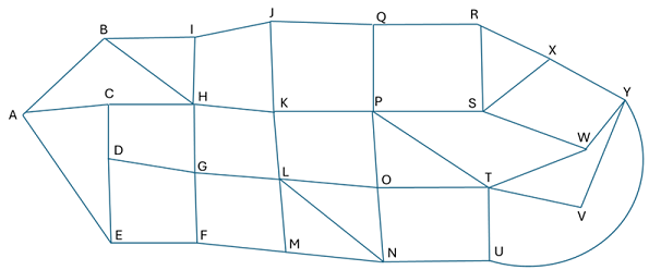
For each mode of travel, the transport system is stored as a network. This network is made up of nodes and links (sections of road, path, etc. which connect two or more nodes together). The networks vary in size, for example the Great Britain cycling network has 8.5 million nodes. Figure 2 illustrates such a network.
We compute the set of accessible destinations for each origin location using a custom implementation of Dijkstra’s shortest path algorithm. The algorithm is developed in Rust, a programming language selected for its superior computational performance compared to Python. Unlike traditional point-to-point shortest path algorithms, our implementation explores all nodes in the network, systematically tracking their associated destinations and travel times.
To account for variability in travel time due to traffic congestion and variations in public transport timetables we have calculated the destinations within reach and their associated travel times for multiple times of day for the modes of driving and public transport. The connectivity scores for these two modes are then the weighted average across all times, with the weights being the volume of mode-purpose specific journeys as apparent from the NTS. For walking and cycling, we assume that there is no variability in travel time, so only one set of scores is calculated.
A cut-off point has been set for a maximum travel time of 60 minutes. This is done to limit the number of calculations, as well as to match the empirical observation of most trips in the NTS taking less than an hour.
Travel Times
Travel time between network nodes are determined by the time required to traverse the link between the nodes, and the turns that need to be made along the route (if any). Furthermore, for walking and cycling, gradients in terrain are taken into account using Tobler's hiker's function. The time on the link itself is determined by its length and the speed of travel, which differs by mode. All links in the graph include coordinate information in the form of polylines that we can use to obtain the angle of the turn as measured in degrees clockwise. In line with Open Trip Planner (OTP), turns between 45 and 135 degrees are classed as right turns, turns between 135 to 225 degrees as U turns, and turns between 225 to 315 degrees as left turns. The quality, comfort, or safety a route is not factored in. For example, if you can cycle somewhere in less time, cycling connectivity increases, but if you make a route safer or more pleasant, connectivity is not impacted.
Limitations
Users should bear in mind the following provisos when looking at public transport routes:
- The Connectivity model assumes that all timetables are adhered to, i.e. there are no delays or cancellation in services. This will make areas with unreliable services appear more connected than they are in reality.
- The model does not include congestion of public transport, that is, the travel times and metric for public transport assumes there is space on every service.
- The monetary cost of travel is not included due to a lack of fares data.
- No park and ride options are currently included. We don’t plan to implement this due to lack of data.
- People are not assumed to have planned their journey. They are modelled as leaving their homes at a given point in time regardless of whether this corresponds to available public transport services. This doesn’t reflect expected behaviour, where people are expected to plan so they minimise long waits. However, the model works this way as it reflects the added utility of more frequent public transport service.
Destination Values
The centroid of each starting square area was mapped to its nearest node on the transportation network for each mode of transport. Each destination node in a network that is within reach of a starting location and while using a certain mode of transport, can be thought of as providing Connectivity value V to that starting location, for each travel purpose. For example, a large employer besides a destination node that connects to a train station means that node will have a high value for the purpose of employment and the public transport mode. For each transport mode, each node in a network has 33 value scores: one for each type of destination. Each type of destination is linked to a travel purpose, to which it contributes connectivity. Each subtype maps to one of six destination types, and has a different diminishing returns parameter, which is used to calculate how much additional value a destination provides to a starting location, depending on how many other destinations of the same type are already within reach of that starting location. The diminishing returns parameter is used to calculate the value of each destination node. Higher values indicate that the diminishing returns of additional destionations of the same type is less strict. These were chosen based on stakeholder engagement sessions and extensive exploratory analysis of the data. The number of destinations also feed in on this - very common destination types tend to be accessible in high numbers, which result in a lower diminishing returns parameter, while rarer destination types are less likely to be reached in high numbers, which results in a higher diminishing returns parameter. The table below shows the purpose, destination type, source of data, and diminishing returns parameter for each type of destination.
For places of employment, the number of jobs at the postcode level was obtained from the Business Register and Employment Survey (BRES) dataset from the Office for National Statistics. Jobs then count towards the employment value at the destination node closest to the centroid of each postcode.
For the travel purpose "visiting friends in their home", the number of people to visit in their private homes is estimated by taking the number of people living in an Output Area (OA) and dividing it by the total dwellings in that OA. We then assume each dwelling in that OA has that many people living in each residence (at the address level) that lies within that OA.
| Purpose | Destination type | Source | Diminishing returns parameter |
|---|---|---|---|
| Education | Primary | DfE | 0.5 |
| Secondary | DfE | 0.5 | |
| Further (16-18) | DfE | 0.5 | |
| SEND | DfE | 0.5 | |
| Private education | DfE | 1.0 | |
| Healthcare | Pharmacy | NHS | 0.25 |
| GP | NHS | 0.5 | |
| Opticians | NHS | 0.5 | |
| Dentist | NHS | 0.5 | |
| Hospitals | NHS | 5.0 | |
| Private health | NHS | 0.5 | |
| Emergency | NHS | 0.25 | |
| Leisure & Community | Pub/bar/nightclub | OSM | 3.0 |
| Sports facility | OSM | 3.0 | |
| Green spaces | OS Green Spaces | 0.5 | |
| Cinema/theatre | OS AddressBase | 0.5 | |
| Culture | OSM | 1.0 | |
| Hall/social club | OS AddressBase | 1.0 | |
| Job centre | OS AddressBase | 0.25 | |
| Recycling centre | OSM | 0.25 | |
| Place of worship | OS AddressBase | 0.5 | |
| Post office | OSM | 0.25 | |
| Post box | OSM | 0.25 | |
| Library | OS AddressBase | 0.25 | |
| Bank/financial service | OS AddressBase | 1.0 | |
| Shopping | Restaurant/takeaway | OS AddressBase | 7.0 |
| General retail shop | OS AddressBase | 7.0 | |
| Supermarket | OS AddressBase | 0.5 | |
| Convenience | OSM | 0.25 | |
| Employment | Job | ONS - BRES | N/A |
| Residential | Residence | OS AddressBase | N/A |
Willingness to travel
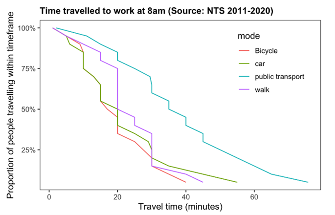
While two destinations may provide the same inherent value, in practice they will not be equally desirable destinations if one takes longer to reach than the other. We would expect the closer location to contribute more to the starting location’s connectivity, with the value of thid trip time depending on how willing the average transport network user is to spend that long travelling to that type of destination. In order to account for this, the Connectivity metric uses National Travel Survey (NTS) data to estimate willingness to travel given distances. Figure 3 illustrates the distribution of how far people travel to work when leaving between 8 am and 9 am, via various modes, based on the NTS. From the data it becomes clear that respondents are willing to use different modes of transport for different amounts of time to reach work at that particular moment in time. In practice, these data patterns will also depend on the purpose of travel.
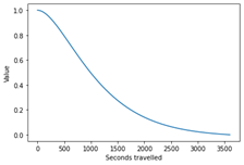
To reflect the travel preferences of people as recorded in the NTS, we model the relationship between the value of locations at a particular node and the time it takes to reach that node using an impedance function. The function takes the time to get to a destination’s node and outputs a multiplier. It takes the form of a curve, such as the example pictured in 4. In the example function, a travel time of 300 seconds returns a multiplier of 0.9, whereas a travel time of 1400 seconds returns a multiplier of 0.3, meaning that the same node would have triple the value if it were 300 seconds rather than 1400 seconds away. To reflect people’s traveling preferences more accurately, the function will be different for each mode, purpose, and time of day. To account for variation in travel preferences at different times of day, we fit impedance functions separately for morning rush hour (07:00-10:00), mid-day (10:00-16:00), evening rush hour (16:00-19:00) and nighttime (19:00-07:00).
The Connectivity model calculates travel routes for all destinations that can be reached in up
to an hour, to reflect the empirical data of very few respondents reporting travel beyond that time.
In the Connectivity model, an impedance function is fitted for each combination of purpose, time of day and mode of travel. Each function covers all starting locations and destinations: these impedance functions are assumed to be the willingness to travel of the average person across England and Wales. The contribution of a single destination node to the Connectivity score for a single origin using a given mode of transportfor a given purpose and time period is calculated by multiplying the destination node’s value by the multiplier given by the impedance function.
The model does not try to account for regional variation in willingness to travel as this would lead to feedback loops. For example, starting locations where many people are using public transport would have a Connectivity score which is disproportionally sensitive to the impact of improvements of the public transport network, thus undervaluing improvements in cycling infrastructure and underestimating how much people’s behaviour would change on being offered a much-improved service. This means that the Connectivity model assumes the preferences of individuals and willingness to travel various distances are identical in all of England and Wales.
Finally, it is important to note that NTS data from 2011-2020 is used in the current version of the Connectivity model. As such, the data that feeds into the model doesn’t capture post-Covid changes in travel patterns.
Diminishing returns
The method of diminishing returns is used to reflect the reality that the contribution to connectivity provided by each additional opportunity, service, or facility becomes smaller as more are available. For example, gaining access to the first few hospitals, shops, or parks in an area brings significant benefits to local connectivity, as these initial options greatly increase choice and convenience. However, once several such facilities are already present, the extra value of adding yet another is less pronounced. By applying diminishing returns, analyses can more accurately represent that early increases in access have the greatest influence on connectivity, while further additions provide progressively smaller improvements.
The connectivity scores
Each destination node in a network that is within reach of a starting location using a certain mode of transport, can be thought of as providing Connectivity value to that starting location for that type of destination. For example, a large employer besides a destination node that connects to a train station means that node will have a high value for Employment and the public transport mode.
The various datasets on destinations gives us access to quite granular destination subtypes which we have grouped into the more manageable six types of destination. Apart from for trips to education, each subtype is assumed equally important within a type of destination. We assume this as we have no information on the number of trips made at the subtype level from the NTS, only the type of destination level. For education destinations, we assume the purpose for each subtype of destination is proportional to the number of pupils attending that type of destination (e.g.: if twice as many people nationally attend primary school than university, then across the country primary schools will get double the weight when calculating the score for education).
The Connectivity model uses stakeholder engagement feedback to determine weights for each of the healthcare subtypes (e.g.: hospitals, GPs, other health facilities). This approach ensures that the relative importance of different healthcare destinations is better reflected in the model.
For each mode of transport, each node has 33 values – one for each subtype of destination.
Being able to access more locations results in a higher value for that destination type. This depends on the type of destination, as follows:
- For employment, value is determined by the number of jobs
- For social visits/residential, value is determined by the number of residents
- For education, value is determined by the number of pupils.
- For all other sub-purposes, value is determined by the number of destinations in reach.
The number of residents is estimated by taking the number of people living in an Output Area and dividing it by the total dwellings in that Output Area. We then assume each dwelling in that Output Area has that many people living there.
Opening times or quality of destinations are not accounted for: all destinations in a category are treated as equal in this regard. This is due to a lack of data on opening hours and how to relate opening hours to utility.
The overall score
To calculate the total Connectivity for an origin point for a given combination of mode and purpose, the relevant contributions of all destinations within reach are run through an additive function.
There are several possible choices for which form the total score function may take. In the current version of the model, we use the log-sum of scores contributed for jobs and visiting residences, and a weighted sum for all other destinations. We use this form because the expected maximum utility of the destination nodes scales logarithmically with the number of nodes. There is a range of literature setting a precedent for and supporting this in the transport space[2]. Alternative options for can also be considered and form part of current ongoing development of the Connectivity metric.
An overall Connectivity score can be obtained for each starting location by taking a weighted average of the mode- and purpose-specific total scores. These weights would be chosen by the user of the Connectivity model. By default, the Connectivity Tool uses weights that reflect overall travel proclivity from the NTS.
Finally, to compare the scores across different starting locations, they are scaled to the score of starting location with the highest Connectivity score, such that the starting location with the best score receives a scaled score of 100, and all other areas receive a score which is relative to that. As such, a starting location with a score of 50 can be considered to be half as ‘connected’ as the best location in England and Wales.
The calculation method
The model works in several stages for a given network and starting location:
- Find the node in the network closest to the centre point of the starting location: this is the ‘start node’.
- Calculate travel times between the start node and every other node in the network which is reachable in an hour.
- Find the node in the network which is closest to each destination: each of these is a ‘destination node’.
- Use the shortest travel times from the starting node to every destination node to estimate the travel times to every destination.
Each destination reachable in an hour contributes to the Connectivity score for that destination with adjustments for the trip time and the ‘value’ of the destination.
- To adjust for the trip time, the time to get to each destination node is put through an impedance function. Lower travel times give a higher output.
- To adjust for the ‘value’ of the destination, the output of stage 5 is multiplied by a value that depends on the diminishing returns parameter and the number of destinations of the same type that were already considered to be in reach. More details of this method will be published in the near future. This gives the contribution of that destination to the starting location’s Connectivity score.
- The contribution of each destination is and summed over all destinations that could be reached to get the given starting location’s Connectivity score for each combination of a type of destination, mode of transport and time of day.
- The Connectivity score for a given mode of transport at a given starting location is the weighted sum of all Connectivity scores for each time of day and destination for that starting location. Weights are the proportion of total trips made at each time of day and to each destination as recorded in the National Travel Survey (NTS) between 2011 and 2020 inclusive.
- Breakdowns are also available by time of day, purpose of travel and mode of travel.
In practice this means that a starting node with lots of destinations (for example lots of jobs), which are quick to reach, gets a high connectivity score.
[1] The sample size requirements and imputation methods are in line with the Travel and Environment Data and Statistics (TRENDS) team (link).
[2] For example:
https://www.sciencedirect.com/science/article/abs/pii/S0965856407000316
And for a more in-depth discussion of the use of logsums: https://www.rand.org/pubs/working_papers/WR275.html